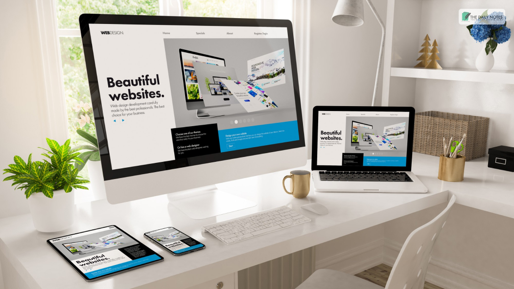
One of the essential criteria for assessing the effectiveness of a site is its usability. In other words, a good website design. How easy and convenient it makes interaction with the dynamic content on web pages from the perspective of users. Thus, those who are your potential customers.
The achievement of full users’ involvement and provoking the desire to pick your offer depends mostly on the appeal of good website design and the first impression of the target audience.
Moreover, having a smart approach, the visitor will take the targeted action and click a CTA button.
User tolerance for all sorts of shortcomings like slow content loading, breakdowns, or inconvenience tends to be zero. Thus, no one will wait too long for the page to be displayed.
So, let’s explore the barriers to user accessibility and how to fix them through good website design.
Web Accessibility Barriers that Your Visitors May Face

There are several different website accessibility barriers that your visitor may face. The following are some of the issues that a good website design solves:
- Only using color to give information: People with color blindness can have trouble understanding the information when your design only conveys it through color cues. Moreover, this can become a poor practice as it introduces an accessibility issue.
Relying only on color cues to convey your message can lead to difficulties for the reader. In addition, screen readers do not inform the users about the text color, which makes it difficult to differentiate between important and unimportant sections.
- Poor Color Contrast: People with limited vision can find it difficult to read the text if there is not enough contrast present between the background and the text. For instance, if something written on a light background is lighter in contrast to it, there will be difficulty.
- Videos without captions: Putting up videos without captions can hinder people’s understanding of the information that is present. Consequently, a good website design has a video with captions.
- Inaccessible online forms: People with disabilities may be unable to understand or fill out the form accurately if the following are missing:
– Screen reader-friendly labels that convey the message to the users. For instance, a text saying “Contact Number” should be present where necessary)
– Clear instructions
– Alerts that act as error indicators for the user to know when a form field is incorrect or missing
- Voice recognition: This is a useful tool to add for accessibility improvement. It is also one of the most sought-after features by users with disabilities. Thus, having this feature makes a good website design. This is especially helpful for people who cannot use a keyboard or a track or mousepad.
What Does A Good Website Design Achieve?
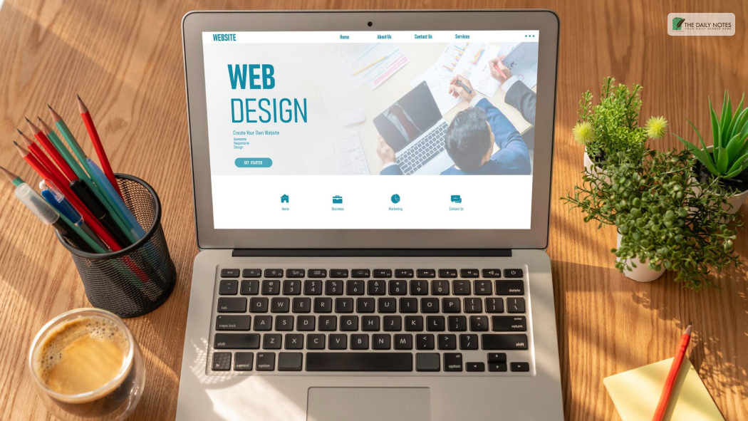
However, by making your website more accessible, business owners can reach the following goals:
- Attracting new customers and increasing sales;
- Boosting brand awareness and expanding the sphere of influence (enter new markets, crush competitors, etc.);
- Simplifying a purchase procedure;
- Boosting loyalty through inspiring web design;
- Informing a wider target audience about the company, brand, services, products, sales, and promotions, related to your business industry news;
- Building the company’s impeccable reputation;
- Provision of services in a way comfortable for clients, for example, through apps;
- Establishing strong emotional connections with a customer.
Now, it is time to analyze the existing website design and understand what kind of communication abilities it has and what you are gaining from it (organic traffic, lead generation, sales-boosting).
If you want to obtain high-quality leads from the site, then you need to think about whether the site solves the consumer’s issues.
Investing in Proficient Web Design Services to Grow Business Through Digital Tools
The site should demonstrate why a specific segment needs your product/service and how a particular individual can benefit from selecting you. After running an advertising campaign that includes developing an outstanding and accessible website design and ada compliant website, the majority of the target audience should easily recognize your brand.
Structure
Site architecture should be simple and intuitive. User-friendliness means that anyone who enters web pages can, without any obstacles, find the section/product/articles or take the desired action in just a few clicks.
Avoiding distractive components in web design, such as bright colors or intrusive animation, is the wisest decision. All this scares off both the user and the search robots, which will hinder search engine optimization and website promotion in Google.
Moreover, it is required to develop the clearest site structure and, if necessary, optimize it.
Loading Speed
Optimizing your site’s loading speed will help to avoid user frustration while waiting for content to display. Also, always be mobile-oriented since the excellent loading speed of the mobile version will drive even more organic traffic.
CTA
Visitors should be encouraged to buy through visible call-to-action (CTA) buttons. So, design the CTA button to be in such a way that it evokes the visitor to end the visit with a purchase.
Attractive designs for such important buttons increase the number of customers for our business.
Relevant Content
Unique articles, striking illustrations, and high-quality infographics are integral parts of website design for producing a desired or intended result.
The task is to engage as many potential clients as possible through attention-grabbing and optimized site elements: relevant articles on your blog, branding components like logo, bio section, contact details, and social proof.
If you want to get the most out of your web strategy, consider partnering with the LuxSite team of developers, marketers, and SEO specialists. Dedicated and passionate experts will execute inspiring ideas to make your website more accessible. Thus, turning it into an indispensable digital marketing tool.
Conclusion
A good website design should have the features present in the preceding section. This will help users with disabilities access your site effectively. This will make your website user-friendly, allowing your visitors to access it completely.
Which one of these features does your website have? Tell us in the comments below!
Read Also:


