


While there are uncountable reasons to update and redesign your website, only one matters – generating more leads. This is where innovative website design ideas come in handy!
Think about it. No matter what kind of brand, organization, or publication you are running, your website’s primary purpose is to act as a real estate where a prospect can run through everything you offer and then choose to engage with you.
Just in case you are wondering where to start, here are ten website design ideas that must be made immediately.
Why Are Website Design Ideas So Important?
Almost 38% of users may bounce off your site if it doesn’t look appealing enough. That’s a significant chunk of your prospective buyers gone without even knowing what you do; in summary, it’s not ideal.
So, what do you do? Undertaking a complete redesign can be expensive and time-consuming. Hence, the best way ahead is to take iterative steps towards an overhaul. Whether you hire an agency like MintTwist or decide to do it independently, choose your battles carefully.
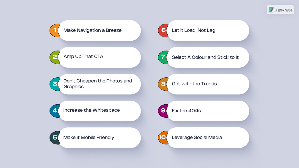
10 Website Design Ideas to Try Right Now:
If you are tired of looking through thousands of useless guides on website design ideas, here’s a list of fool-proof ideas!
Check these out and share them with your designer friends:
1. Make Navigation a Breeze
Simplicity is your best friend with navigation. Users look for familiarity when searching a site. Ensure your category, About Us, contact information, and blog pages are right before the visitor for easy access.
Your sitemap and menu hierarchy should be in line with your user’s expectations, as well. Comprehendible content without unnecessary jargon helps the visitor instantly know what’s on offer.
2. Amp Up that CTA
A call-to-action is a button or link where you tell the user exactly what they need to do next. It reinstates what may seem obvious and helps convert your prospect into a lead.
Given that it is the bridge between having a visitor and gaining a client, your CTA should be explicitly visible and easy to understand. Using a contrasting color and bold font makes it stand out and helps the user with some direction.
Additionally, ensure that your CTA text is relevant to the page. For example, someone researching web redesign should be guided towards more information before getting a sale suggestion.
3. Don’t Cheapen the Photos And Graphics
There is nothing worse than finding unappealing and pixelated photos on a website. It not only projects unprofessionalism but also makes the user question your authenticity.
Choosing and taking high-quality graphics that align with your brand image go a long way in defining authority and encouraging association. This also extends to the use of stock photography. Users who find generic content on your website may think of you as non-unique and uninteresting.
The alternative here is to use real-life photography, allowing users to connect with the topic at the base level. You don’t need to be fancy. A simple team photograph or a picture from your operations works, too.
4. Increase the Whitespace
Whitespace is how you choose to establish the relationship between your elements. Distantly placed content with ample whitespace in between helps perceive a break between different categories. On the other hand, parts set closer to one another may be seen in unison.
Think of whitespace as the directional guide that allows the visitor to move from one part to the other in a seamless motion. Using whitespace effectively, you can lead the buyer’s journey from your landing page to the value proposition, finally reaching that good old CTA button.
5. Make it Mobile Friendly
Over 61% of phone users are likely to connect with a local business if they have a mobile-friendly website. Having a website that takes care of cross-device compatibility is as imperative as having a website itself.
Since website responsiveness is now a part of the SEO trends and a ranking factor for Google, this is not a luxury but a necessity. Plus, web design is all about creating a pleasant experience for the user, and we don’t remember the last time someone loved the pinch and zoom feature.
6. Let it Load, Not Lag
Since you only have a few moments to capture your audience. Time lost in loading the page can mean revenue loss for you! No matter what website section the visitor is on, they always expect fast loading.
You can optimize your page speeds by compressing large images, using a minimalistic layout, holding back on unnecessary plugins, and prioritizing content loading. The use of a content delivery network works wonders as well.
7. Select A Color And Stick to It
Consistency is one of the most underrated parameters of success. Coincidentally, the same applies to web design, too. Selecting a brand color palette and using it across the site helps the users associate a pattern with your organization.
You can always experiment with saturation to give it a different look on various pages. Additionally, compare the hues considering color theory and understand how your audience will react to each change.
8. Get with the Trends
No one likes dinosaurs in real life. If you’re still sticking to an age-old format with no updates, then there is a good chance that your audience might migrate to your modern competition. Users expect to see something new that intrigues and engages them.
Retro fonts, parallax scroll animations, 3D visuals, and AR are some of the game-changers from the past year. You can choose to implement it all but be careful not to overload the site and always keep it user oriented.
9. Fix the 404 Errors:
404 pages are next in line to slow loading when it comes to user dissatisfaction. As it happens, with all redirects, a visitor intends to reach a solution. If a path is broken midway, they may consider your website incomplete, leading to a heavy bounce rate.
Google Search Console allows you to root out such errors and provide a robust experience to your readers. Nevertheless, if any 404 persists, make sure that they are aesthetically designed and help the user with the next step towards resuming their journey.
10. Leverage Social Media
It is a digital work out there. Even the most physical aspects of your business need validation before it goes up on Facebook, Instagram, Twitter, and LinkedIn. After all, why would you speak to only a few when you can speak to them all simultaneously?
Hence, adding social media share buttons amplifies your reach and aids in quick recognition. The metrics you accumulate with the content that is shared can further help in creating audience-relevant information.
Conclusion
There are hundreds of different permutations and combinations that can be applied when thinking of a website redesign. The possibilities are literally endless. So, it is relatively simple to be overwhelmed – but there are plenty of website design ideas to choose from!
With the improvements mentioned above, you can build a starting point for your web design and update it with the current requirements in no time.
Read Also: