


The human eye has the ability to perceive over 10 million different shades, and the colors have incredible influence on our brain. They are all around us, giving life and beauty to the world that surrounds us. The way we see and experience some color can affect our mood pretty much.
Read on this source more about color perception, but also vision anomalies that can occur: https://www.aao.org/eye-health/tips-prevention/how-humans-see-in-color
Cultures around the world have a different relation toward colors, but it is a fact that they take an essential place in our lives. Often, based on the color of a wardrobe or make-up, we can figure out what kind of person someone is. Can this also apply to colors in some ambiance or in someone’s living place?
The colors have a psychological effect, and this is evident. Therefore, we have to subordinate the place we’re living to our eyesight, which is closely related to our brain. The enjoyment for all the senses will provide us with a better quality of life in our home.
Red or Blue, Which Are You?
When it comes to the painting of exterior and interior, Ann Arbor painters generally use two terms, which include warm and cold colors. When an unskilled person looks around the spectrum, it seems that there are only a dozen colors. But there are so many shades which can be applied to home design, so this simple division is necessary for the beginning.
While many individual factors can affect our perception, there are some color effects that are considered to have a universal meaning. Warm colors, which include red, orange and yellow, arouse a wide range of emotions – from warmth and comfort to anger and aggression.
On the other hand, the colors on the blue side of the spectrum are known as cold colors, which are blue, purple and green. They are often described as calming, but they also can stimulate feelings of sadness or indifference.
Warm Colors to Keep You Cozy:
The warm colors are bright and energetic, and these are mainly shades that attract attention. We can usually find them in regions with warm climates, and they fit perfectly into the ambiance, combined with some sandy colors. For houses on the north, warm colors bring additional warmth to every living space.
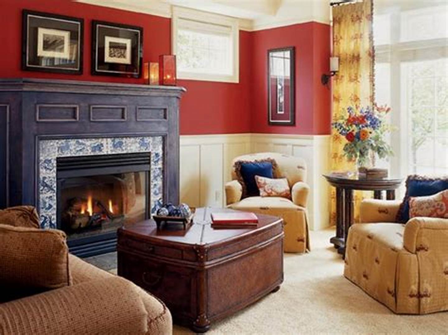
Red is considered a color that increases appetite (you may have noticed in a few familiar fast food chains). Pale red or yellow is the ideal color for the dining room, combined with some neutral color, such as beige or white. Too much red, yellow or orange can have the opposite effect.
Warm colors are ideal for rooms where we spend time with family and friends, such as living room, dining room, and kitchen. However, since these colors make you feel energetic, they are not recommended for rooms where we need peace, such as a bathroom or a bedroom.
Cold Colors to Calm You Down:
Colder colors are best for rooms where we need some privacy. Green symbolizes health, a new beginning and wealth. As this color calms, you can decorate the terrace with these shades, or some space with plenty of light, like a winter garden. Even in the bathroom, it is recommended that you have some green or blue interior details.
If you work from home and have a special room for your customers and clients, one wall there could be blue. This color causes a feeling of security and trust, as well as a friendly atmosphere (more tips about how your interior décor can affect your work find here). Violet, whether it’s pale or dark, is most often associated with creativity and productivity, and is an excellent choice for study rooms.
Neutral Colors:
Black, white, and gray are the colors used in home design to reduce or further emphasize the effect of other colors. While white has a broad purpose because it looks clean (mostly used in rooms with a high frequency of people), black is not a choice for wall painting because it is too dark and can seem depressively.
And on the other hand, a single black detail on the inner wall gives extra esthetic value to space. For the exterior design, it’s still a bit too extreme, even as a detail. The gray color is monotonous so you must pair it with any other color, depending on your wishes and ideas.
Scientist and psychologists agreed that colors have an important role in our life. Art and architecture are proofs that our perception can differ, but that feelings colors provoke in us are usually the same.
Read Also: